TD AI Hub is a working wireframe prototype of an AI layer for the TD mobile app. It helps customers understand their month, see what is coming and test big decisions before they make them. TD Intelligence is the AI behind it.
Key features and design decisions
Each feature answers one customer question, and each decision below came from making that answer faster to trust.
The Problem
Banking apps show what happened, but rarely what it means or what to do next. Customers see balances and transaction lists, then do the math in their heads or in a spreadsheet.
- • Statements show numbers, not meaning.
- A mid-month total says little until it is compared like for like.
- • Budget tools feel like homework.
- Categories and limits need setup before they give anything back.
- • Purchase calculators ignore real life.
- They don’t know the customer’s income, bills or savings goals.
The opportunity: use the data the bank already holds to answer everyday money questions in plain language, and let people try a decision before committing to it.
Approach and persona
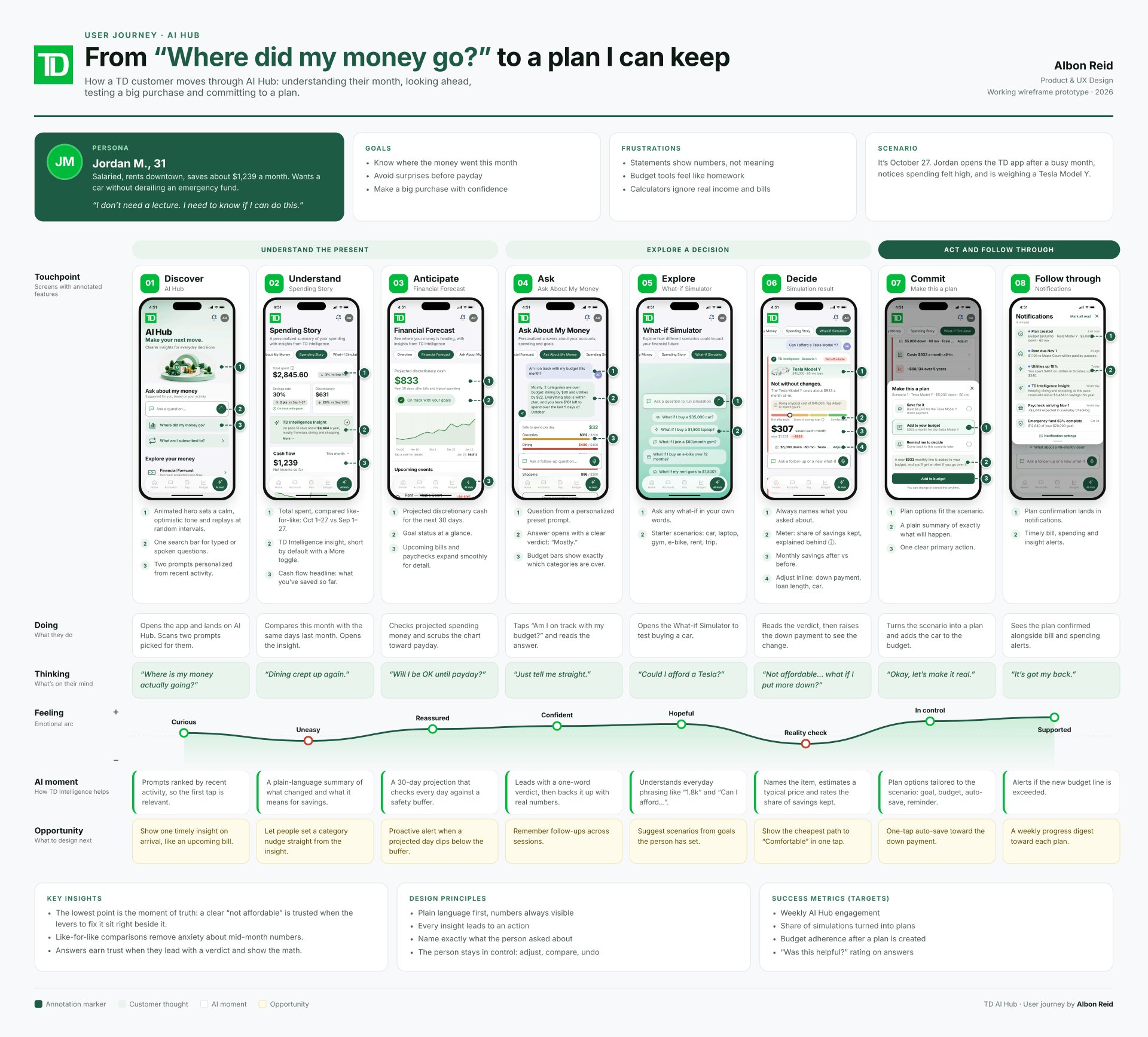
The design follows one customer from confusion to a plan they can keep. The persona is Jordan M., 31: salaried, renting downtown, saving about $1,239 a month and weighing a car purchase. Jordan's line:
“I don't need a lecture. I need to know if I can do this.”
The journey runs in eight stages across three phases:
- 1. Discover (AI Hub): “Where is my money actually going?”
- 2. Understand (Spending Story): “Dining crept up again.”
- 3. Anticipate (Financial Forecast): “Will I be OK until payday?”
- 4. Ask (Ask About My Money): “Just tell me straight.”
- 5. Explore (What-if Simulator): “Could I afford a Tesla?”
- 6. Decide (simulation result): “Not affordable… what if I put more down?”
- 7. Commit (Make this a plan): “Okay, let's make it real.”
- 8. Follow through (notifications): “It's got my back.”
The emotional low point is stage 6, the “reality check.” The design bets that a clear “not affordable” is trusted when the levers to fix it sit right beside it.
Design principles
- • Plain language first, numbers always visible
- • Every insight leads to an action
- • Name exactly what the person asked about
- • The person stays in control: adjust, compare, undo
This is a little description underneath your image.
Iteration
The biggest changes came from critique rounds on the What-if Simulator and Spending Story.

This is a little description underneath your image.
Everyone loves little teasers, you can use this space to add your own. Everyone loves little teasers, you can use this space to add your own.Everyone loves little teasers, you can use this space to add your own.

This is your headline
You can you this place to talk a little bit about the image on the side.

This is a little description underneath your image.